Search This Blog

Showing posts with label Westbourne Grove. Show all posts

Tuesday, 28 June 2011

Devil's Festival at The Print Room


After a successful first year The Print Room present to you The Devil's Festival, an eclectic mix of dance, music, theatre and art projects. This two week summer bonanza brings together all aspects of the creative world in some exciting contemporary pieces, celebrating the inspiring new work of talented young artists, choreographers, and performers. I went along to the final invited dress rehearsal to check it out before anyone else.


It was pouring with rain, and visitors to the Print Room were huddled in their tiny foyer pleased to be somewhere dry. First up in the rehearsal was the dance piece, 'Kanaval' choreographed by Hubert Essakow. The routine is inspired by the photographs of Leah Gordon and the film The Devine Horsemen, some of which are on display elsewhere in The Print Room vicinity. It is performed by Benny Maslov, Benjamin Ord, Hannah Rudd and Fukiko Takase and is the longest of the four featured festival pieces. There is something instantly aggressive about the movement and gestures we are watching, the dancers are almost animalistic. It is striking and in some places quite harrowing to watch such force, but I found it moving and gripping, and was hugely impressed with the dancers' unfaltering stamina.


The next two plays were'Swan Song' by Anton Chekhov and 'Fewer Emergencies' by Martin Crimp. The Chekhov piece is only 18 minutes long, and the playwright claimed to have written it in just one hour and five minutes. The play shows a brief encounter with aging actor, Svetlovidov and is pretty much a monologue, an afterthought of his life in the theatre and his love of the stage. Malcolm Rennie gives a stunning performance as Svetlovidov, nuanced and believable and carefully thought through. Despite its brief length it felt like we were being given a real insight into this characters life.


The second dramatic piece is a short play from trendy and fiercely modern playwright Martin Crimp. Don't expect to understand it, I couldn't, we listen to bursts of conversation excerpts that are entirely abstract and bizarre. The acting here is impressive too, with particularly convincing performances from the two girls Emma Dallow and Nicola Harrison.


Finally we are treated to Petra Jean Philipson's incredible sound and light installation. While we wait in the foyer a huge white tent is put up in the theatre, filled entirely with white fluffy pillows. We are invited inside, but not until we have slipped into more appropriate outfits: all in one white paper boiler suits complete with hoods and booties! After everyone stopped giggling and got over the novelty of the idea it was quiet and contemplative in the tent. ‘Of the things we do not see’ is an experience that is supposed to heal your body using creative stimuli. Amazing Mongolian singing and music sooths you gently and the vibrations melt peacefully into your body. It is an amazing concept and the 20 minutes of meditation were not enough for me, I soon fell asleep and would have been quite happy to spend the night in this wonderfully calm structure.


The Festival is on now, for two weeks until Saturday 2 July. Only on Saturdays will all four pieces be available to see, on weekday nights the shows will alternate, each pair showing every other night, book here.

Thursday, 16 June 2011

Chris Kenny at England & Co Gallery


It is tricky writing about your own father’s work, to avoid bias and try to be objective. My dad has his studio at the bottom of our garden, and so I am always very aware of the presence of his work, but rarely do I get to see pieces before they are exhibited in their finished state.


A few days ago, friends, family and art enthusiasts gathered at England & Co Gallery on Westbourne Grove for the private view of Chris Kenny’s most recent work. It is always intriguing to watch an artist’s work evolve, and this show illustrates Kenny’s progression perhaps more than ever before.


He studied Art History at the prestigious Courtauld Institute, and started his creative career very much as a painter, with a symbolic interest in chairs and trees, and patterns and symmetry in natural things. His work began to move into more museological territory and soon he was carefully constructing boxes of precisely selected and arranged things. Seemingly random items that Kenny recognised a special quality in, artifacts to which Kenny attached labels according to his imaginative associations.


In the current show pieces of this kind predominate, stunning clean white boxes house swarms of cut out faces from photographs, or phrases from books, or segments of maps - things plucked from their familiar environment and made into something new. A collection of dissections, sentences with lost meanings and portraits of forgotten people are given a new lease of life in Kenny’s unusual creations. Clean measured pictures that are mesmerising aesthetically but also hold so many strands of meaning. The story boxes are a perfect example of this, odd phrases are assembled in a brilliantly funny order to form a short narrative, every time you look you can discover something new, visual or intellectual. And that’s the point, you can take away from it what you like, a new perspective, a funny anecdote, a quote full of wisdom, or just the pleasure of looking at something so still and beautiful.


Interestingly, Kenny begins to hark back to his painting days with a group of new works, of cut bright paper, out of which a statement is cut. They are still carefully considered but have a more painterly quality, a striking balance of colour and design. They are gloriously refreshing, and would add a touch of wacky beauty to any room. Declarations read “Hazard” or “Are You Awake?” - they are stylish, and, dare I say it, even a little bit pop-arty.

And then there are the sheds, adorable little buildings constructed from found wood, each with its own character and charm. Again letters are cut out, incisions reveal a quote “Nulla in Mundo Pax” (There is no peace in this world), but it seems there is peace in the refuge of these tiny shelters. They sit neat in line across the back wall of the gallery, immaculately hung - an unforgettable presence in the exhibition.


This collection of Chris Kenny’s works is more daring, and more thrilling than has been seen previously. With Kenny’s unique pieces increasingly being shipped off to be exhibited internationally, this is a rare opportunity to see his newest collection in its full glory. A display that will simultaneously sooth and scream at you.


Exhibition continues until 9 July, see more information here.

Friday, 3 June 2011

Georgia Russell Exhibition at England & Co Gallery


Cutting paper has become quite a trend in the art world, with whole exhibitions based on the method. Scottish artist Georgia Russell does this more effectively than most, producing wonderful, powerful yet transient works hand cut with a scalpel. Thousands of delicate incisions transform books and photographs into hauntingly beautiful structures. Some sit magically in antique bell jars while others are suspended like a spirits of their former selves.


‘Cutting through Time’ is Georgia Russell’s fifth solo exhibition at England & Co Gallery, though her creations are often seen in group exhibitions too. Having followed her work, I personally feel this is the best to date - a dark and austere collection of works that stand statuesque in the wonderfully bright white space. Perhaps the most momentous pieces are those that hang imposingly in the window, impressive ethereal spirals; they certainly draw you in from the street.


More than usual, it seems Russell is preoccupied with texture in this exhibition, experimenting with larger, more expressive cut designs which consequently have a greater presence and spirit. It is interesting to see the contrast between the delicate paper and the wild energy of the cutting. Multi layering and repetition create intricate patterns, and memorable shadows.


I have always loved Russell’s enchanting cut books, but in this exhibition I found the photographic works particularly intriguing. ‘Stereoscopic’ is static in its acrylic case and yet looking closer you notice a swirling movement, a gentle breeze travelling through the black and white landscape. ‘Wild Waters’ is another example where the cutting emphasises the drama and turmoil of the image.


‘Cutting through Time’ is a truly stunning exhibition that will amaze and astound even the most cynical of critics.


Visit the England & Co website here.

Monday, 13 December 2010

Hot on the Highstreet Week 29 - The Boys are Back in Town


Courtesy of a very special boy, this week I will be taking on a male Hot on the Highstreet. It’s been a long time coming and at last there is a subject(s) worthy of this post. So, I introduce to you: two innovative men’s (sort of) highstreet shops: Pretty Green, and Sandro – Paris, both new to the London scene.

Pretty Green is Liam Gallagher's clothes shop on Carnaby Street. All the pieces are designed by Liam himself and have a real sense of his character about them. There are two distinct collections making up the brand. The Green Label is a casual range for everyday wear – signature pieces, well put together. The Black Label features classic British tailoring, with real attention to detail, using only the finest fabrics. I particularly love the khaki cotton parka, £245 (shown above) which has a vintage feel but with real quality, and has logo patches sewn on and engraved buttons. Pretty Green is doing so well they are all set to open branches in Manchester and Glasgow any day now. I’d like to say well done Liam, we always hear about female celebs creating fashion labels but for a male celeb it’s rather more impressive; who said fashion was just for girls?

On 25th November Sandro – Paris launched their first menswear store in the UK, on Westbourne Grove. On offer is classic Paris elegance with an injection of fun... check out the website here. I have always admired this designer and am currently lusting over their black playsuit, £160, that Alexa Chung wore to the store’s launch party, paired with a casual white tee – she looked painfully cool. Their men's clothes are just as unique as the ladies'. Smart slimline trousers and beautiful patterned silk scarves can be found on the boys' clothes rails. The pieces aren’t cheap but for such stunning staples they are worth every penny.

Watch out ladies, the boys are back in town, and they’re looking seriously stylish.

Wednesday, 8 September 2010

OTTO Cornmeal Pizza


The idea for Otto pizza came to creators Tom and Rich when they were on a road trip across America. In Portland, Oregon they tasted cornmeal crust pizza in a local restaurant there, Dove Vivi. After tasting this heavenly pizza they decided to bring the idea to the UK, and so recently opened up OTTO in Westbourne Grove.


Cornmeal is a flour made from dried corn and is a staple food in many countries. Often it is known as polenta or grits. At Otto they use a cornmeal and flour mix for the crust to achieve a delicious texture and flavour. This cornmeal crust is much thicker and sturdier than most standard pizza bases allowing Otto to load the pizzas with more creative and generous toppings.


Although these pizzas aren’t completely gluten- or wheat-free, they have a much lower wheat content making them much more enjoyable for those with mild intolerances.


At Otto you can enjoy quirky, alternative flavours. Last weekend I tried three varieties: Jerk Chicken, Sweetcorn & Caramelised Onion and Pepperoni & Roasted Vegetables. All three were yummy, although I preferred the meat toppings. Unlike most pizzas, Otto’s food won’t leave you feeling bloated, despite the cornmeal crust being more filling. Unusually I found myself savouring the crunchy crusts rather than begrudgingly pushing them to one side to nibble on at the end. And after two slices I felt well-fed, healthy and completely satisfied.


Don’t believe me, try it for yourself...

Wednesday, 1 September 2010

Notting Hill Carnival


How many of you went to Carnival this weekend? I went along on Bank Holiday Monday afternoon to enjoy the music and the spectacular parade. Even the sun made an appearance.

The Notting Hill Carnival is an annual event, which has taken place on the streets of West London since 1964. It is predominantly led by the British African-Caribbean community, particularly the ‘Trinis’ (Trinidadian and Tobagonian British population). The Carnival attracts over a million people every year making it the world’s second largest street festival, after the one held in Trinidad and Tobago.

After working in Notting Hill for five years, I love going to the Carnival every year to celebrate the end of summer and to see the transformation of the London roads. It is wonderful just to walk through the brightly coloured fragrant streets but my favourite part of Carnival is the dancing through the crowds by enthusiastic dancers in specially made extravagant costumes. We found a convenient wall to climb up and watch from, which enabled us to see and join in without being squashed by the crowds.

Definitely worth experiencing at least once.

Tuesday, 6 July 2010

Talking of Yves: England & Co

N.H. Stubbing: Spring Ceremonial, 1959


'Talking of Yves'
is another thought-provoking exhibition from England & Co. The show examines the life and work of artist Yves Klein and the social and artistic web in which he moved, examining all the influences that surrounded him. A variety of work is on display from artists Yyonne Hagen, Tina Keane, Susan Hiller, Iris Clert, N.H. Stubbing, Ralph Rumney and Yves Klein.

The pinnacle of the exhibition for me was Tina Keane’s touching film of an interview with art critic Yvonne Hagen, in which she remembers her relationship with Yves Klein. Other intriguing works are those of artist N.H. Stubbing, who was the husband of Hagen. His paintings convey an insistent rhythm; he uses his hand to print repetitively across the canvas.

The space at England & Co is limited and yet never overcrowded; what they show is always perfectly selected and presented. The work has more purpose than just looking pretty, it is also there to teach us about the artist that created it and the world in which he or she worked.

Exhibition continues until 21 July.

http://www.englandgallery.com/

Tuesday, 25 May 2010

FABULOUS FURNIVAL


Ha - Ha!, letterpress print, 11.75 x 11.75 inches


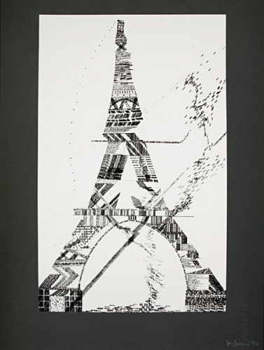
The artist John Furnival will appeal to many: his works are intelligent, witty and aesthetically very satisfying.

England & Co Gallery on Westbourne Grove is a wonderful space to display art. The high white walls provide an ideal background for the great variety of work they show, contemporary and modern, paintings, constructions, installations and performance art. John Furnival's work looks beautiful on the walls, even more stylish than the dresses for sale in the trendy clothes shops that surround the gallery.

Never Mind - Doesn't Matter, letterpress print, 11.75 x 11.75 inches


This exhibition has a strong 60s pop vibe. You could imagine seeing one of Furnival's prints as an album cover. Indeed Peter Blake (who did the Beatles' psychedelic Sergeant Pepper's album cover) is a contemporary of Furnival, and similarities can definitely be seen between both artists' prints. Many of the works on display are text related, and use repetition obsessively. A favourite of mine is 'Never Mind - Doesn't Matter', a letterpress print, where the green and black compacted words produce a striking design - with a statement we should all be reminded of once in a while!


Eiffel Tower, silkscreen print, 30 x 22.25 inches

England & Co display John Furnival only until 5 June, but don't fear if you miss out on this exhibition there is sure to be another eclectic mixed show on, so pop in for your art fix.

England & Co, 216 Westbourne Grove, W11 2RH.

Open Monday-Saturday 11-6 pm. Free Entrance.

http://www.englandgallery.com/index.htm